Close Enough to Read: Workshop Rules for Hero Paperwork
Paper is never just paper on a film set. On a wide shot, a letter is a pale rectangle on a kitchen table. In a close-up, it is a bundle of decisions: the weight of the stock, the way the toner sits, the fold that does not quite line up, the date that has to match the scene before it. UK productions are full of this stuff — council tax reminders, NHS appointment letters, tenancy agreements, local free sheets, planning notices taped inside a window. At SDS Props, we treat hero paperwork as a build material, not a print job.
Start with the stock, not the typeface
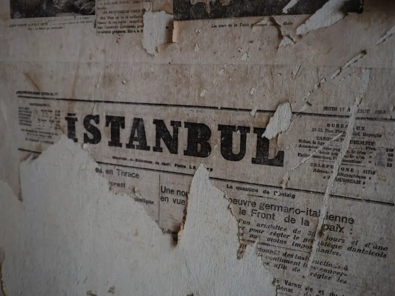
The first mistake is printing on brilliant white 80gsm office paper and hoping the camera will be kind. It will not. Pure white blooms under set light and reads as photocopy rather than document. Most letters want an uncoated stock with a bit of tooth: 100gsm to 120gsm for solicitor letters and formal notices, 80gsm to 90gsm recycled for NHS appointments and council reminders. Newspapers are their own thing — 45gsm to 50gsm newsprint, slightly off-white, with a visible grain and a tendency to cockle in a damp UK unit. Test every stock under the actual camera. If it glows, it is wrong.
For forms, carbonless sets still sell the gag of bureaucracy better than a single sheet. For passports and travel documents, we build an in-world object rather than a facsimile. Fictional country, fictional crest, fictional number. The point is plausibility, not forgery.
Typography that behaves like bureaucracy
Hero paperwork has hierarchy even when it is boring. Logo or crest at the top, reference number, date, address block, salutation, body, small print. Council notices tend to be sans-serif and blunt; legal letters lean on Times New Roman and too many paragraphs. We use real-world typefaces because they carry institutional memory, but we do not simply download a template and change the name.
Small typographic details do the heavy lifting. A reference number that repeats on the envelope. A date formatted the British way — 9 November 2026, not November 9. A signature that looks hurried rather than drawn. An address that uses a plausible street name but not a real one. Phone numbers should be Ofcom drama numbers, not a random mobile that belongs to someone in Croydon. Postcodes are trickier; we keep them clearly fictional and have production legal check anything that might land on a real doorstep.
Newspapers need mastheads, column rules, bylines and a page number. The headline should be specific enough to feel local — a leisure centre closure, a planning row, a lost dog — but not so specific that it accidentally describes a real event. We print background copies at a lower contrast so they sit back, and keep hero copies crisp.
Ageing without going period-drama
A letter that is meant to be three days old should not look like it was dug out of a loft. Cold tea, dilute acrylic, a little dust and a bone folder will get you further than a full immersion in coffee. We fold with a folder rather than a sharp crease, soften corners by handling them, and add a faint ring mark only where a character would actually put a mug down. For notices, sun fade and a bit of damp ripple are more convincing than torn edges. For passports, scuff the corners and dull the cover slightly; do not add fake foxing to a document that is supposed to be current.
Seal with a matte medium if the paper will be handled a lot, but test for glare first. Iron folded sheets on low heat to flatten them without polishing out the texture. If a prop needs a staple, use a staple and then dull it. Rust marks are a story detail, not a default.
Continuity is a paperwork problem
Every hero document gets a document bible entry: scene number, character, date on the page, issue date, signature, folds, stains. We photograph both sides and keep a clean master plus at least one distressed hero backup. Background copies can be generic, but the moment an actor reads from it, it becomes a hero and joins the system.
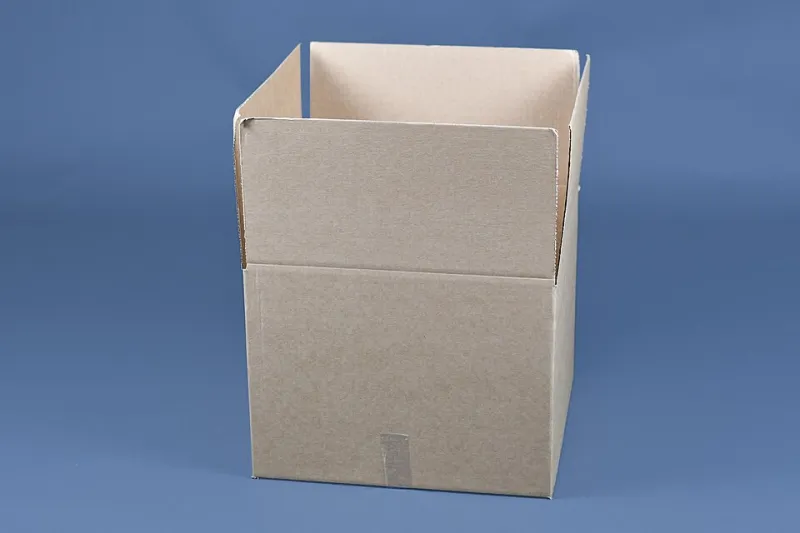
Signatures are their own continuity trap. We keep a signature card for each character and use the same pen across copies. Dates have to match the script and the props around them. If a scene is set on a rainy Tuesday, the letter cannot be sun-bleached. Store paper in a really useful box with silica; UK units are damp, and damp paper changes shape between takes.
Clearance and the near-miss logo
Real logos, crests, addresses and phone numbers are not worth the risk. We build fictional councils, fictional letting agents, fictional newspapers. If a script genuinely needs a real brand, that is a clearance conversation, not an art department decision. Production legal should see anything that looks official. A council notice can mimic the format of local government without borrowing a real authority's identity. A passport can be convincing without being a copy of a real one. The close-up rewards the near-miss only if it stays clearly fictional.
In-world signage is paperwork at scale
Planning notices, site office signs, laminated warnings and no-parking boards are paper props with weather problems. We print on foam board or vinyl, laminate anything that has to survive a British exterior, and add tape residue, screw holes and a bit of grime at the fixing points. A laminated A4 notice with a slightly crooked zip tie reads more truthfully than a perfect sheet. The same rules apply: plausible contact details, fictional authority, consistent dates.
The SDS Props rule is simple: if it can be read, it can be questioned. Build the paper prop so the answer holds up in the close-up, then make sure the continuity binder agrees.